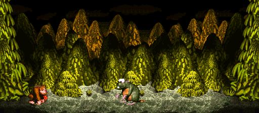
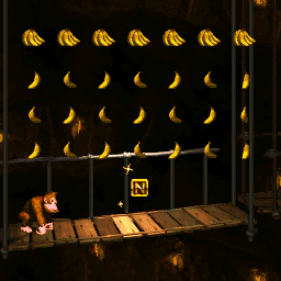
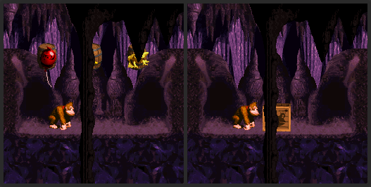
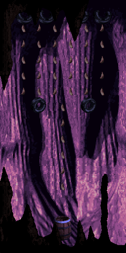
Honestly I don't recall there being more than three bonuses in this format, but I could just be forgetting one.
Sounds like it's possible to do pretty well in all of them, if your timing (and Kong choice) is impeccable.


Raccoon Sam wrote:Looks smooth! Only complaint is the background. Because the millstones occupy the SNES Layer 2, this level only has a 2bpp Layer 3 as its background and I can tell that's not it.
Still, spot-on job with the CSS3 animations!


![[G] :g:](./images/smilies/g.png)
![[O] :o:](./images/smilies/o.png)
![[G] :g:](./images/smilies/g.png)
![[O] :o:](./images/smilies/o.png) , Q!
, Q!
![[O] :o:](./images/smilies/o.png) are too close to eachother, should be higher up. And the brown Zinger afterwards is supposed to be moving around in small circles and not stay on the same spot.
are too close to eachother, should be higher up. And the brown Zinger afterwards is supposed to be moving around in small circles and not stay on the same spot.
Return to DKC Projects/Fanworks
Users browsing this forum: No registered users and 17 guests